How To Create Custom Blocks With Shopify AI Block Generator
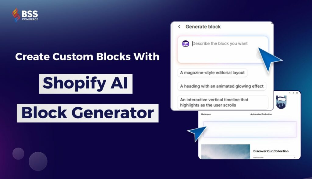
Shopify’s Summer 2025 update comes with a variety of new tools to help you build and customize your store faster than ever. And guess what is the highlight? A brand-new Shopify AI Block Generator feature that lets you create custom blocks just by describing what you want. No coding skills needed, no complicated design tools, just type your idea, and Shopify turns it into reality for you.
In this post, BSS Commerce will walk you through how the new Shopify AI feature works and share some useful prompts based on what we’ve learned from actually using it to design stores for our clients.
Shopify Summer Update 2025: the Horizon Theme Series and AI-Generated Blocks
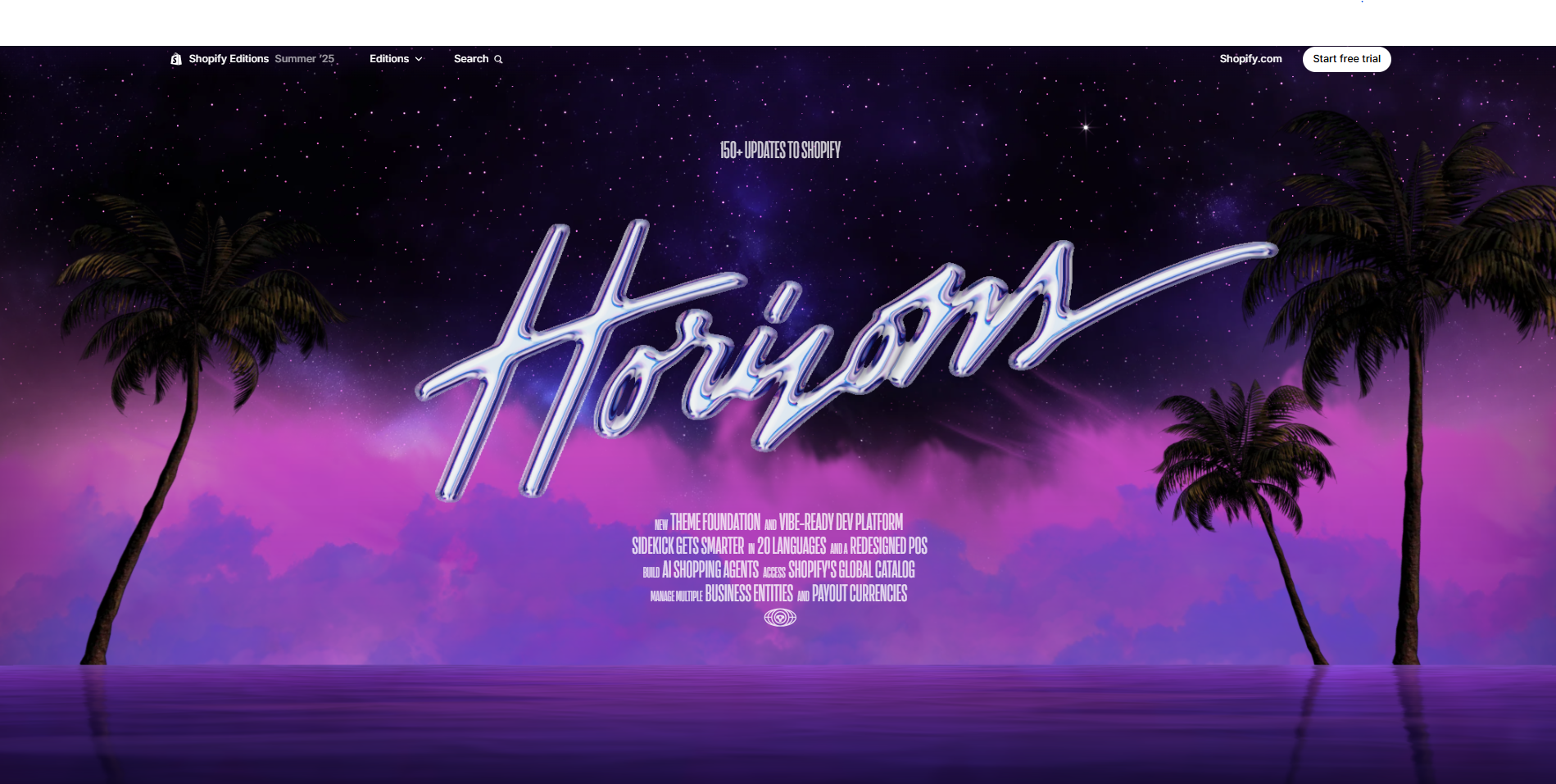
The Shopify Summer 2025 update introduces one of its most thrilling improvements with the release of the Shopify Horizon Theme Series. This includes 10 new themes built for flexibility, speed, and creative control. The theme editor has also been upgraded, allowing you to add multiple blocks within a single section, nest elements easily, and rearrange layouts without touching any code.
But the most exciting part is definitely the Shopify AI block generator! Shopify has added a new function that lets you describe the kind of block you want in your natural language, and it will instantly create that block for you. It’s a huge time-saver if you’re building your store from scratch or testing new ideas.
Now, we will show you exactly how to use the Shopify AI block generator and share our top 10 best prompts based on real client projects, helping you make the most of this powerful new tool.
How to Create a Custom Block Using the Shopify AI Block Generator
You’re new to Shopify’s AI block generator? Don’t worry! Creating a custom block is easier than it sounds. Follow the steps below to start building your own sections in just a few clicks:
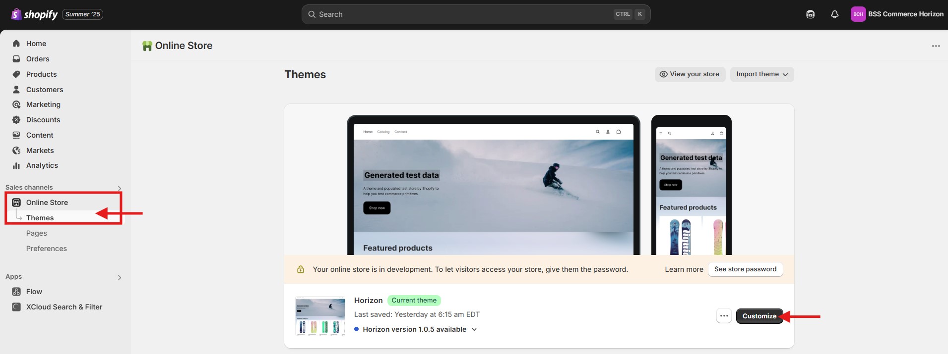
Step 1: Go to Shopify Admin > Online store > Select one of the Horizon Theme Series > Click Customize.
If you haven’t started your store yet, grab the Shopify 3 Months for $1 deal to get started affordably.
Step 2: In the left-hand column (the Sections panel) > click Add Section > Choose the section where you want to generate a custom block.
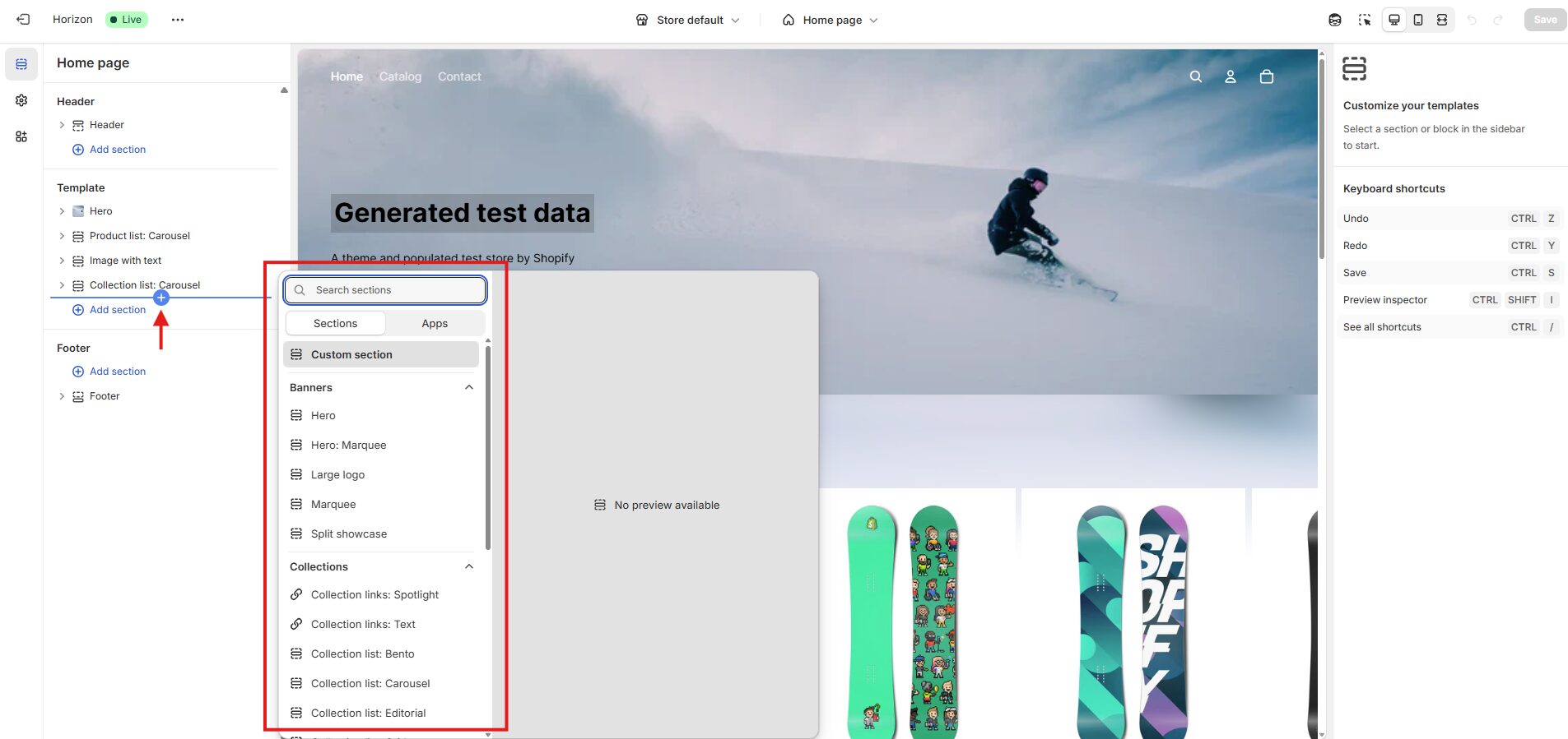
Step 3: Within that section, click Add Block > Select Generate.
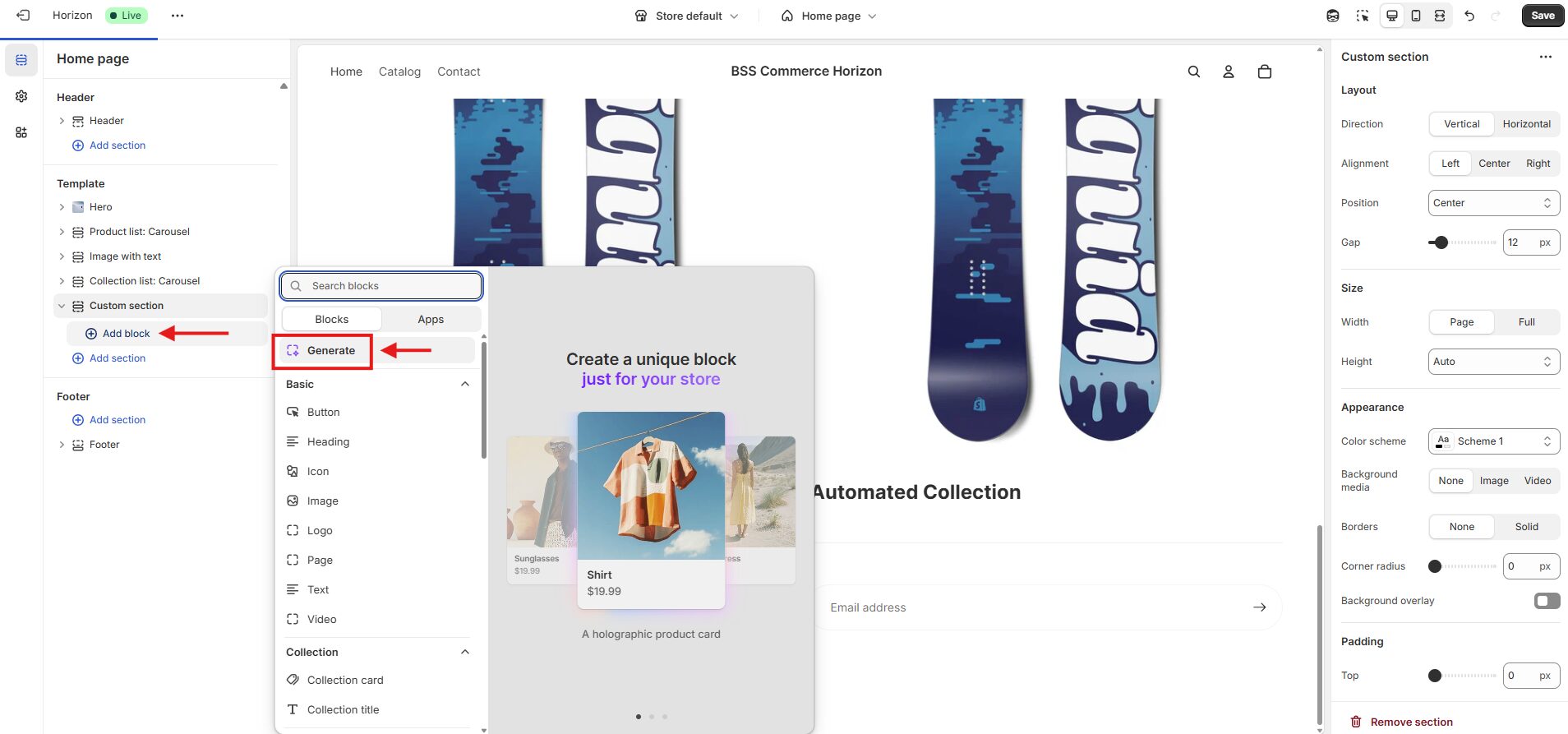
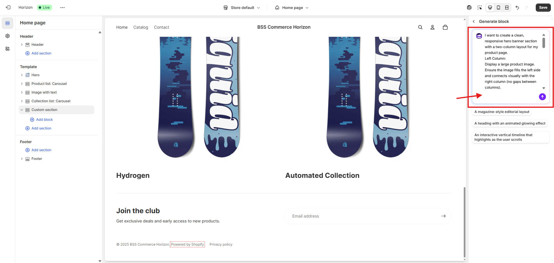
Step 4: In the right-hand column (Shopify AI panel), use your natural language to describe your design in the first box. From now on, we’ll refer to this box as the “Shopify AI input box.” Then, press “Enter”.
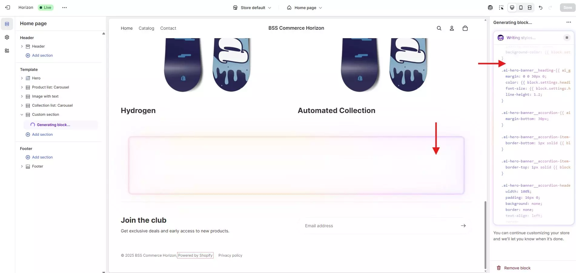
Step 5: Depending on the complexity of your prompt, generation may take 30 seconds to 1 minute. So, let’s be patient during the process!
Step 6: After generating a custom block, you can continue editing it by entering your request into the Shopify AI input box in the right-hand column.
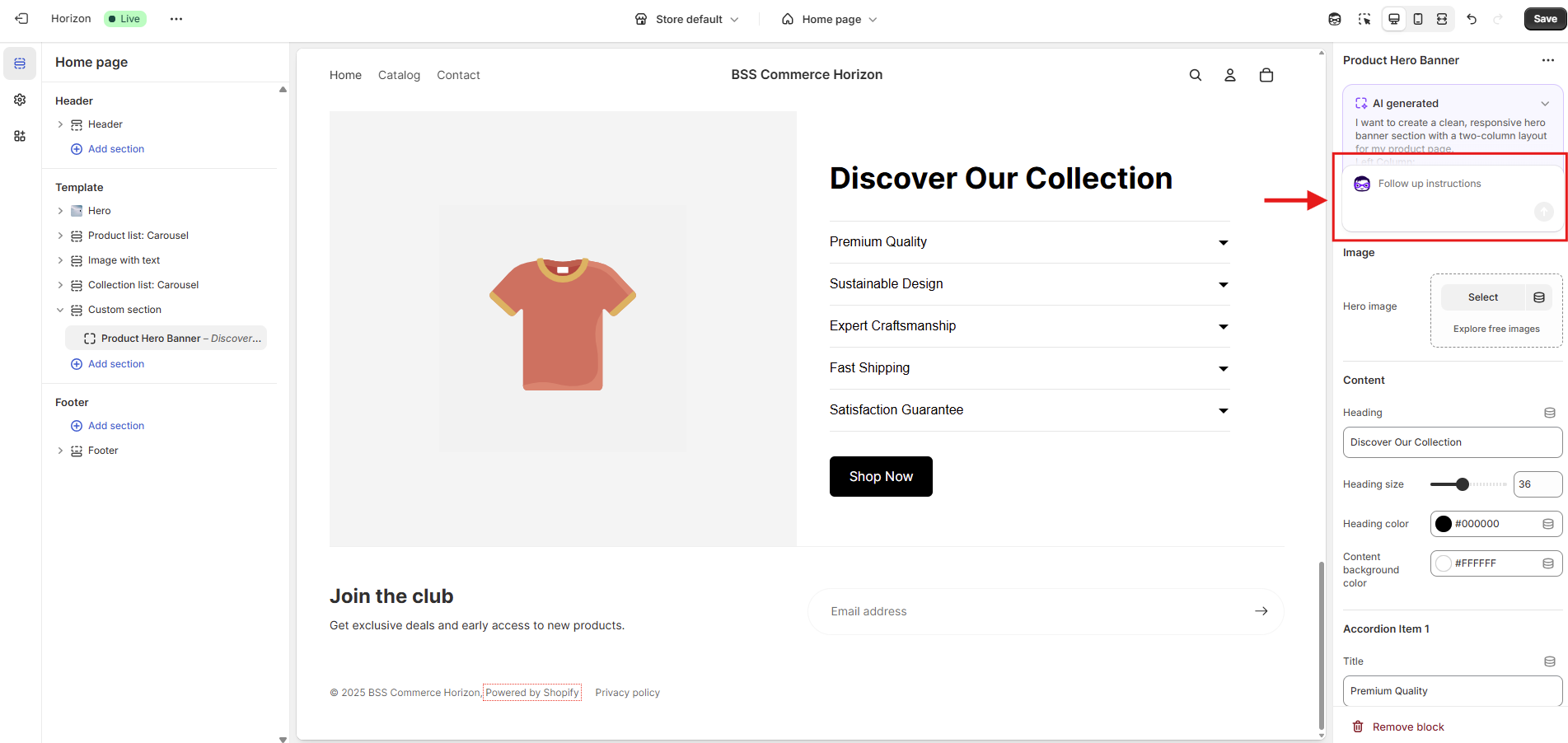
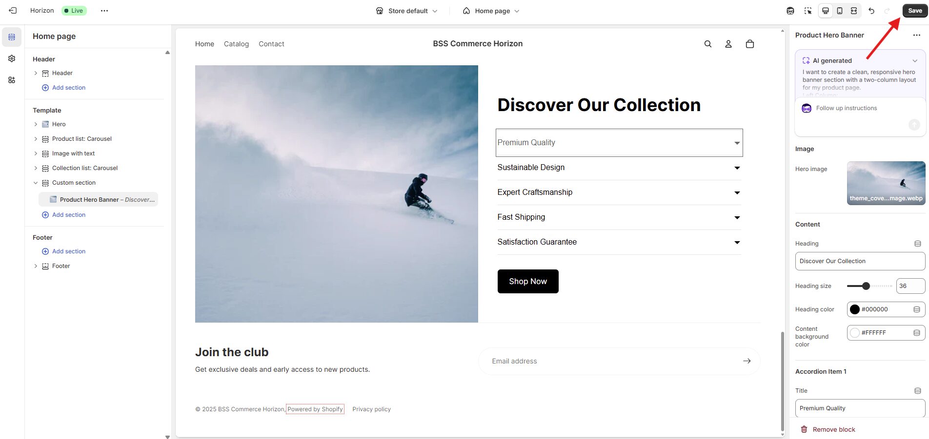
Step 7: Once you’re satisfied with a custom block, click “Save” in the top-right corner of the screen.
How to Write an Effective Prompt to Generate Custom Blocks Using the Shopify AI Block Generator
You already have a design idea in mind
If you have your own idea, let’s use your natural language to describe it in the Shopify AI input box. For example, suppose you want to create a Benefit Highlights Section, you might type something like:
“Make a section with some icons and text to show product benefits.”
Sounds simple, right? But when you submit this prompt, the results often come out messy, like misaligned layouts, missing spacing, or unexpected elements.
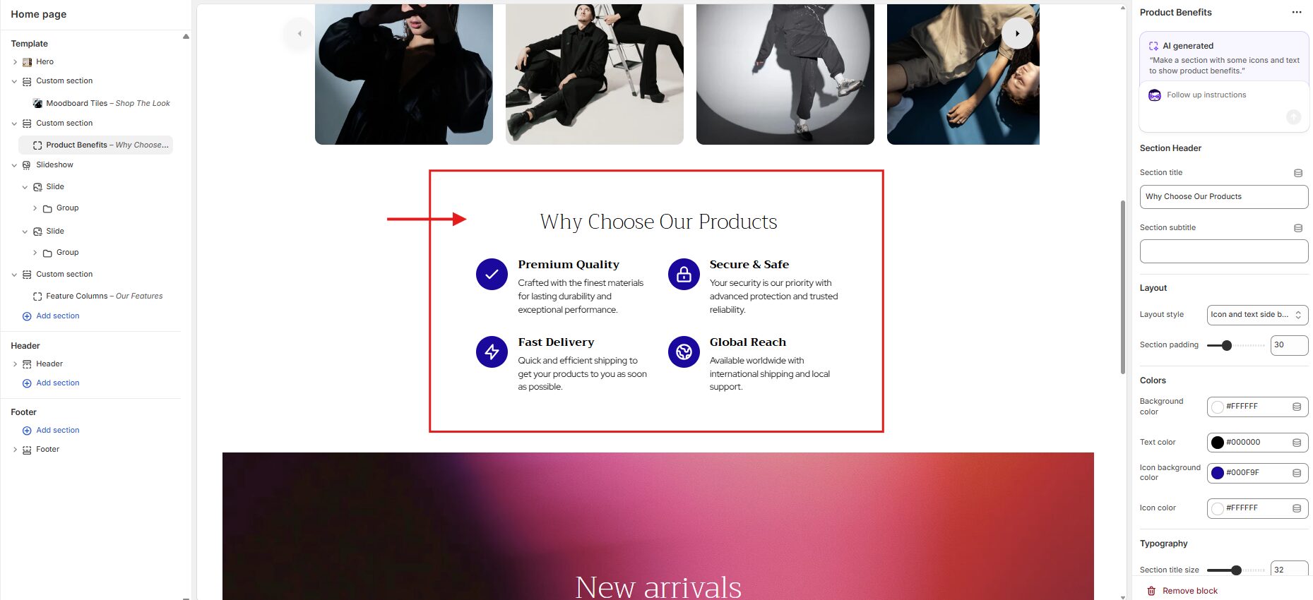
To avoid these issues and ensure a better experience with Shopify AI, we recommend using a clear and structured approach when writing prompts. Based on our experience, a well-structured prompt typically includes four key elements: Layout → Content → Visual Style → Functionality. This structure helps Shopify AI to understand clearly and generate results that match your expectations.
Let’s take the original idea and turn it into a complete prompt using this method. Here’s how you should describe it:
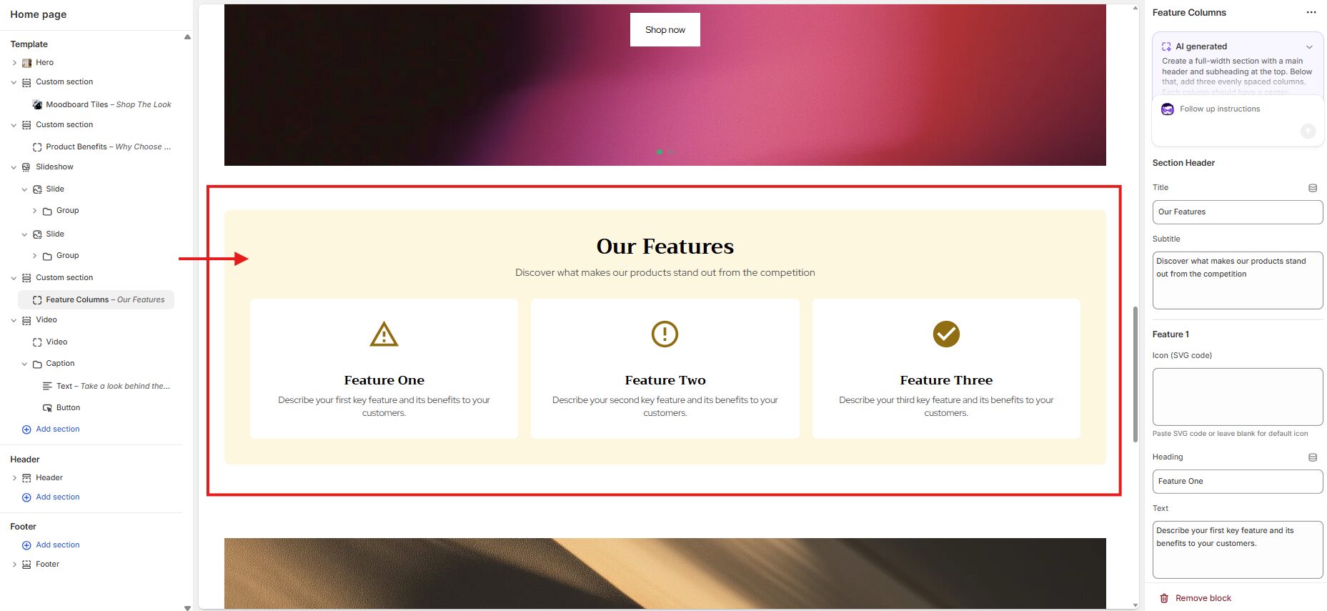
“Create a full-width section with a main header and subheading at the top. Below that, add three evenly spaced columns. Each column should have a center-aligned icon at the top, followed by a bold heading and a short descriptive text underneath. Use a soft background color with rounded corners, and make sure all elements are vertically aligned and visually balanced. The layout must be fully responsive and display all three columns in one row on both desktop and mobile devices.”
And here’s the better result after using our recommended prompt structure, with a clear layout and aligned margin with the other sections in the Theme Editor:
You don’t have a design idea yet
If you feel confused or have not come up with your ideas, don’t worry! You can find inspiration by browsing other Shopify stores’ designs and capturing the sections you like.
Then, paste that section screenshot into ChatGPT or Grok, and use the following prompt to ask AI to help you generate a design prompt: “I want to create a section with a layout similar to the one shown in the image. Please help me write a layout description and a prompt that I can use to ask Shopify Sidekick to generate this design. Just focus only on describing the structure and elements layout, no need to include the actual text content from the image.”
After completing the design prompt, copy and paste it into the Shopify AI input box. Be patient and wait for about 1 minute, your generated block will appear!
Top 10 Prompts to Generate Custom Blocks with Shopify AI Block Generator
After building hundreds of Shopify stores for BSS Commerce’s customers using the Shopify AI block generator, we’ve put together our top 10 favorite prompts that consistently deliver great custom section results. If you like any of the designs, you can use the prompt below to recreate a similar block for your own store.
2-column Hero Banner Section
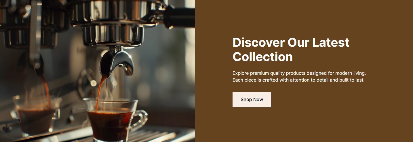
Create a hero banner with a two-column layout. The Left column (1/2 width) has a full-width image that spans edge-to-edge with no padding or margin. This section should visually showcase the product or lifestyle shot. The right column (1/2 width) contains a headline, supporting paragraph, and a call-to-action button. The background of this column should use a soft solid color that complements the image. The overall section should be horizontally aligned and balanced. On mobile devices, stack the image on top and the text below.
3-Column Icon Feature Section

Create a full-width section that contains three equally spaced vertical columns, each displaying a center-aligned icon, a bold heading, and a short descriptive text beneath. The columns should have vertical dividers between them. This section should span the entire width of the screen with no left or right padding or margin, giving it a seamless, edge-to-edge appearance. Additionally, the background color of the section should be customizable, and each icon should support image upload, allowing users to replace the default icon with their image.
Product Feature Highlights Checklist Section
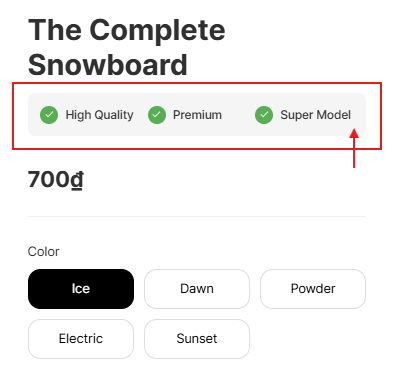
Create a small horizontal feature highlight section placed just below the product title. The section should have a soft-colored background with rounded corners, and the color should be customizable. Inside the block, display three feature items fully in one line with even spacing. Each item should include a small green checkmark icon enclosed in a circle on the left, followed by a short, bold text label on the right. Make sure the icons and text are visually balanced on one line, and the entire section aligns with the margins of the product heading and surrounding content.
Horizontal Feature Tabs Section
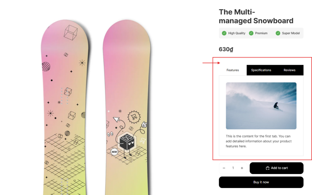
I want to create a horizontal tab layout with three tabs, following the design requirements below:
Tab Layout:
- Display the three tabs in one horizontal line, evenly spaced and fully aligned.
- The tab background and text color should be customizable.
- Font style should be normal weight, with a clean, modern look. Use the same font as the website for all tab titles.
Functionality:
- Clicking on each tab should reveal its corresponding content directly below the tab row.
- Only one tab’s content should be visible at a time.
- The content container should have a bordered rectangular frame.
- The height of the content container should adjust dynamically based on the content length (not fixed height).
- Allow each tab to include text and/or image content inside.
Responsiveness & Spacing:
- Ensure the layout is responsive across all devices, including mobile.
- On smaller screens, tabs should remain horizontally scrollable or adapt gracefully for touch interaction.
- Make sure the padding and spacing of this section align with the rest of the site layout.
3-Column Feature Section
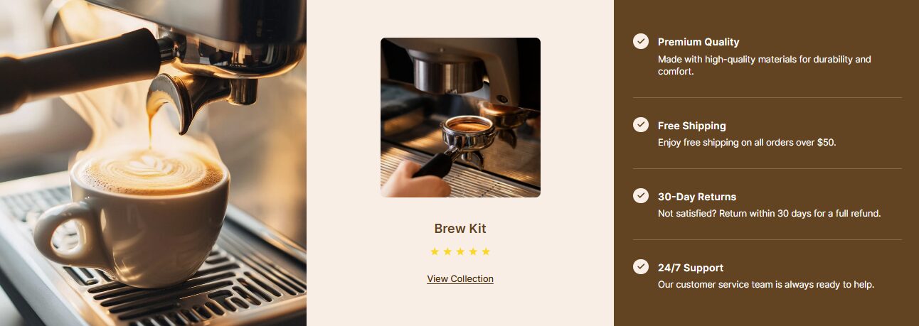
Create a responsive 3-column feature section designed to highlight a single collection in a clean, modern layout. The structure and functionality should be as follows:
Left Column (1/3 width):
- Embed a vertical image or video block, vertically centered.
- The media should not be cropped and must fit naturally within the section.
- The image should be full bleed (edge-to-edge), without any frame or padding.
Center Column (1/3 width):
- Highlight one featured collection.
- Content must be centered and fully clickable, including:
- Collection name
- Collection image (editable)
- Star ratings
- A “View more” anchor text that links to the collection
Right Column (1/3 width):
- List four product benefits stacked vertically.
- Each benefit must include:
- A tick/checkmark icon enclosed in a circle
- A bolded title
- A short, descriptive supporting line
- Place evenly spaced dividers between each benefit block
- Use a solid contrasting background color in this column to visually separate it from the left and center columns, which should have a light, neutral background.
Design and Layout Requirements:
- The layout must be fully responsive and optimized for both desktop and mobile views.
- On mobile, the stacking order should be: Media (left column) → Collection (center column) → Benefits (right column).
- The overall section must align perfectly with the page’s global margins and spacing.
- The section height should adapt appropriately to fit the content in the right (benefits) column, ensuring visual balance across all devices.
Why Choose Us Section
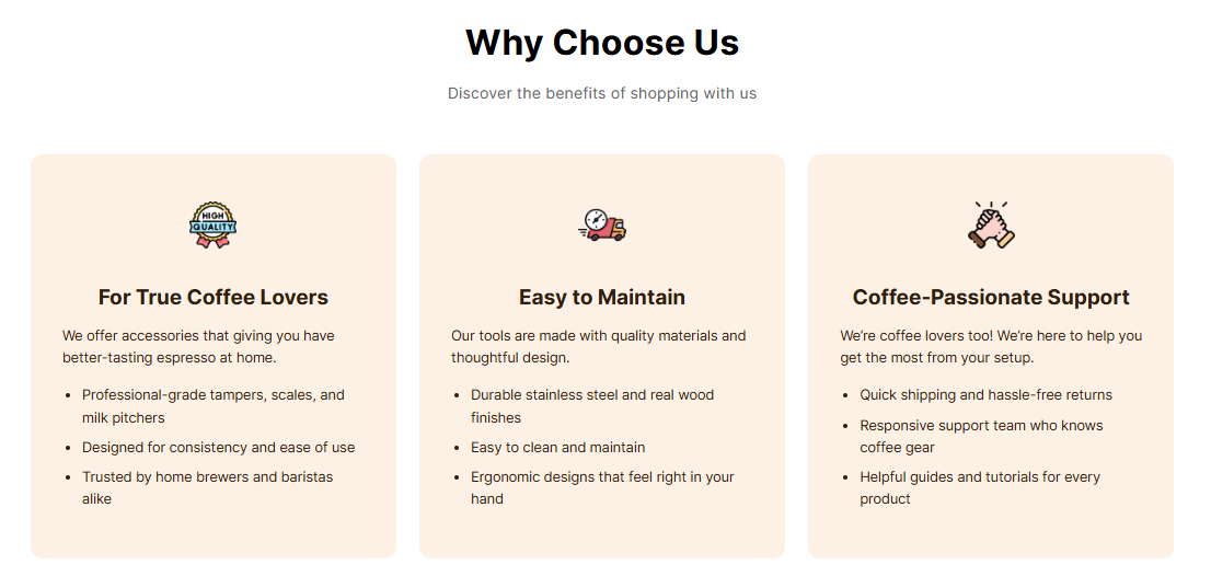
Create a “Why Choose Us” section that clearly communicates key advantages to customers. The section must follow the layout, content, and design specifications outlined below.
Structure:
At the top of the section, include a main heading (e.g., “Why Choose Us”) and a subheading (e.g., “Discover the benefits of shopping with us”), both center-aligned. Beneath the headings, create a 3-column layout. Each column must include:
- A center-aligned icon inside a small circular frame, where I can upload and replace the image manually from my desktop.
- A center-aligned bold title (e.g., “Fast Shipping”).
- A short description is placed directly below the title.
The text under each title must be aligned to the left margin within the box and support full customization, including:
- Line breaks
- Paragraph spacing
- Bullet points (if needed)
Design Requirements:
Each column should be styled as an individual card box, with:
- Internal padding
- Rounded corners
- A background color that is customizable via the theme editor
The card boxes must have consistent dimensions and spacing across all three columns.
Layout & Responsiveness:
The section must:
- Align exactly with the page’s global margins
- Match the vertical spacing of the sections above and below
- Be fully responsive across all device sizes (desktop, tablet, and mobile)
- On mobile devices, stack the columns vertically in the correct order, maintaining visual hierarchy and spacing
- Preserve consistent padding and spacing between each column on all screen sizes
- Adjust height automatically to accommodate varying text lengths, while keeping visual balance
It is essential that this section perfectly aligns with the margin and spacing of the section directly below it. No layout shifting or margin misalignment should occur.
Making Process Section
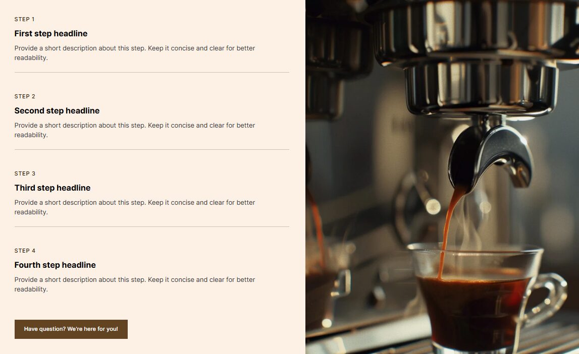
Create a two-column section layout with the following structure and requirements:
Left Column:
Include 4 vertically stacked steps. Each step must contain:
- A step number label (e.g., STEP 1)
- A bold headline
- A short description
- Separate each step with a thin horizontal line for improved visual clarity.
- The background color of the left column must be customizable through the theme editor or section settings.
Add a single call-to-action button placed below Step 4, not inside any individual step. The button should:
- Appear below all four steps
- Not stretch the full width of the column; it should only be as wide as the button text
- Be left-aligned with the content
Right Column:
- Display a single large image or video
- The height of the right column should match the total height of the left column content (including all steps and the button), ensuring perfect vertical alignment between the two columns
Design and Layout Requirements
- The section must align exactly with the page’s overall margins and match the spacing of adjacent blocks above and below
- Ensure no gap or empty space between the two columns, they should sit tightly next to each other
- Use consistent horizontal padding throughout
- The layout must be fully responsive and adapt cleanly across all screen sizes (desktop, tablet, mobile)
Hero Banner Section
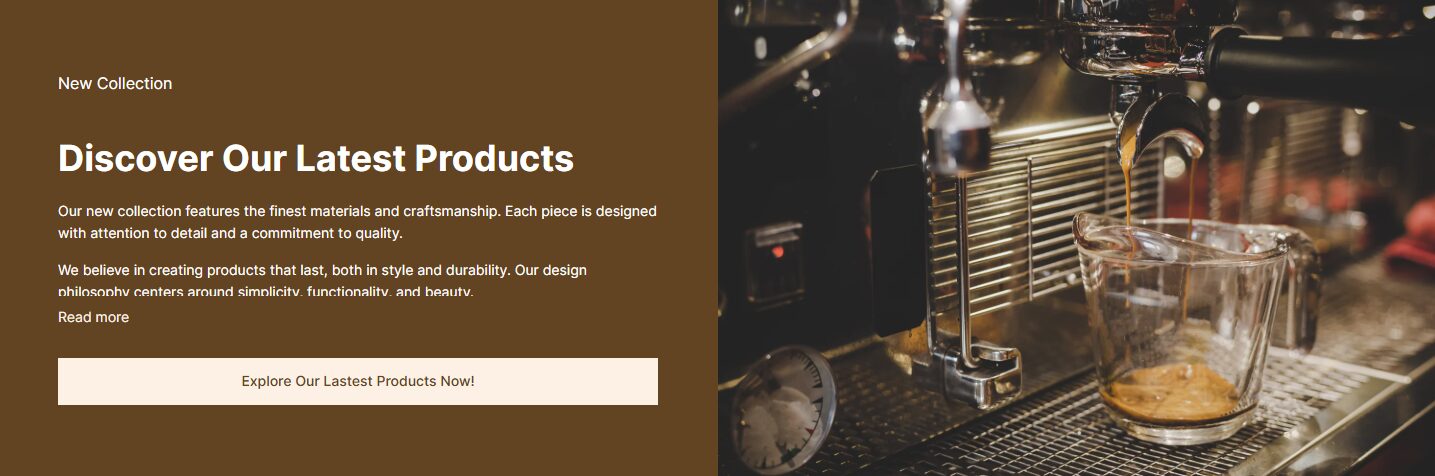
Create a hero banner with a two-column layout.
Left Column (50%)
This column should contain the content and have a soft, solid background color that complements the image on the right. Include the following content elements:
- A subheading
- A main headline
- A supporting paragraph that supports line breaks, bullet points, and rich text formatting
- A call-to-action button that has a fixed width that fits the length of the text label, not a full-width style.
In the supporting paragraph, only the first four lines should be visible by default. Below this, add a “Read more” link to expand the full content and a “See less” link to collapse it again. The “Read more” and “See less” links should be left-aligned and clickable.
Right Column (50%)
- This column should display a full-width, edge-to-edge image with no margin or padding.
- The image should showcase the product or a relevant lifestyle scene to visually support the content.
Design and Layout Requirements
- On the desktop, ensure the two columns are horizontally aligned and visually balanced.
- On mobile, the layout should stack vertically with the image appearing on top and the text content below, both using 100% width for full responsiveness.
- Ensure the overall design is clean and modern, with all spacing, margins, and typography consistent with the rest of the store’s layout.
Hero Banner Accordion Section
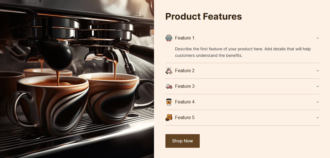
Create a clean, responsive hero banner section with a two-column layout for my product page.
Left Column:
- Display a large product image.
- Ensure the image fills the left side and connects visually with the right column (no gaps between columns).
Right Column:
At the top, include a heading. Below the heading, add an accordion-style content block with 5 collapsible items.
- Only one accordion item should be expanded at a time.
- Each accordion heading should display a small icon before the text, which can be customized by uploading an image file.
- Replace the default plus/minus icons with caret icons (up/down arrows).
Below the accordion, add a “Shop Now” button:
- The text should be regular weight (not bold).
- The background color of the button should be customizable.
- The button should only be as wide as the text, not full width.
Design and Layout Requirements:
- Ensure the entire section is fully responsive on both desktop and mobile.
- The left and right columns must be visually connected without any visible gap or border.
- The margins and padding of this section should exactly match the surrounding sections for consistent alignment.
- Use the same font as the current site.
Vertical Info Cards with Image Section
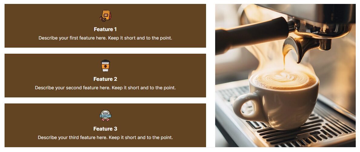
Design a responsive section with the following layout and features:
Layout: The section should be split into two columns:
- Right column (40%): Place a large rectangular image here. The image should stretch fully within this column, with no extra padding or margin, and be visually connected to the content on the left.
- Left column (60%): Create a vertical stack of 3 cards, each card taking up approximately one-third of the column’s height, with equal vertical spacing between them.
Card Design: Each card should contain:
- A circular icon at the top: The icons should be customizable, allowing users to upload their own images from desktop to replace the default icons.
- A text area beneath the icon for title or description
- The overall card content should be vertically stacked and aligned to the center, with balanced spacing and a clean, minimal design.
Design Requirements:
- The entire section’s width and padding must match the margins of the rest of the page, ensuring perfect alignment with the sections above and below.
- Keep the overall design clean, modern, and consistent with existing layout spacing and structure.
- Maintain responsiveness across devices. On mobile, consider stacking the image on top or below the cards if needed for optimal viewing.
Tips to Make the Most of the Shopify AI Block Generator
Through my own experiences after building many Shopify stores for clients using the Shopify AI block generator, I’ve identified several practical tips that will help you create better and more consistent custom sections for your store.
Avoid clicking “Save” or generating a new block too soon
If you click “Save” or generate a new block before finishing your current custom block edits, Shopify will automatically save your current design. After that, you won’t be able to continue editing that block afterward.
Always check both desktop and mobile displays
After creating a custom section, don’t forget to review how it appears on both desktop and mobile. Some layout structures may look perfect on a desktop but show problems on mobile, such as spacing problems or content overflowing outside the screen.
Export the custom block’s code to save your favorite designs
Although using a similar prompt, the output design may be different between times, including margin spacing, text casing (uppercase vs. lowercase), or border styles. Thus, if you get a design you like, let’s save it by copying and saving its code to your document.
Here are the steps to keep your favorite block design:
- Step 1: Choose the custom section that you want to save
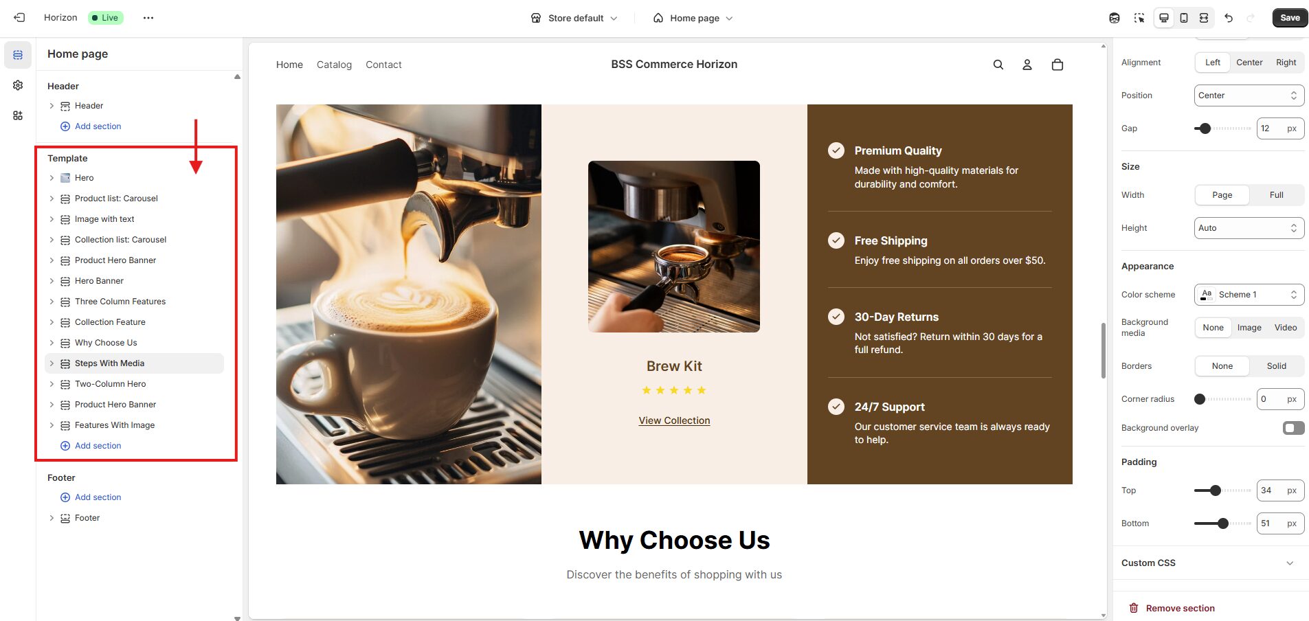
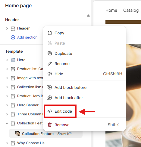
- Step 2: Right-click > Select “Edit Code”
- Step 3: Press Ctrl + A to select all the code
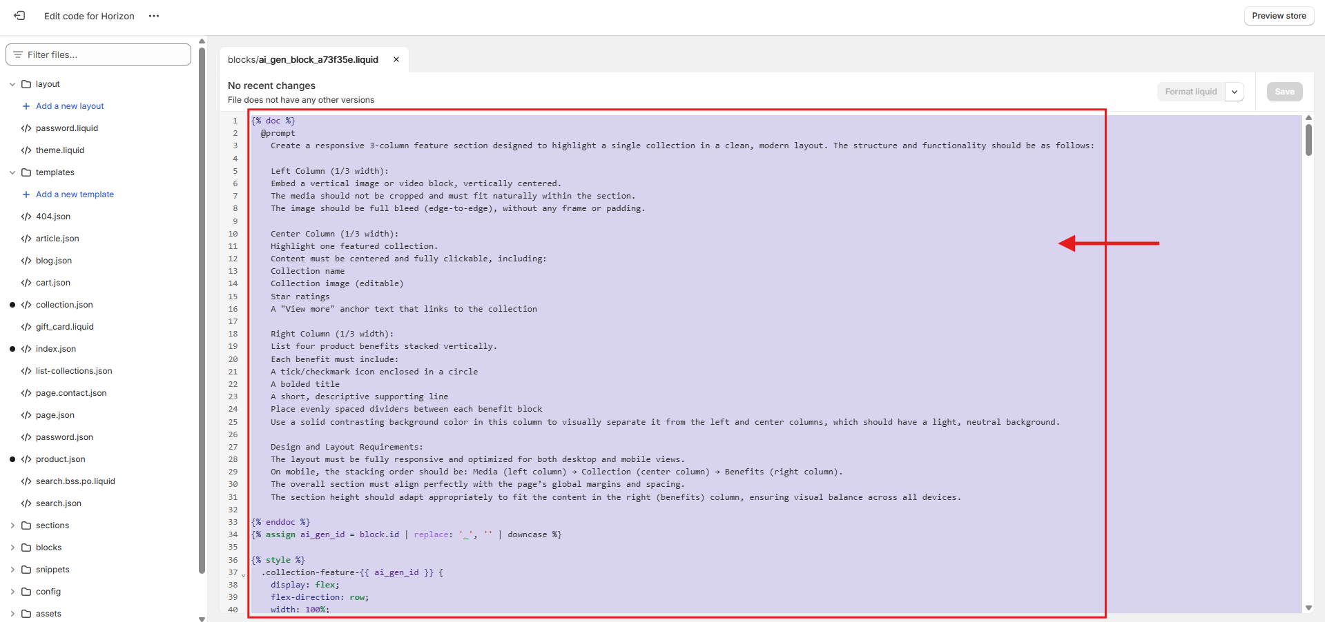
- Step 4: Paste the code into your file to keep it for yourself
💡Reminder: If your next generation result doesn’t match the original, you can change it to the previous version by going to Edit Code > Ctrl + A > Delete all, then Paste the code you saved earlier and click Save.
Fix the margin alignment issues with our follow-up prompts
First-time custom sections may not align completely with your store’s margin layout. In these circumstances, try to regenerate the block by using a follow-up prompt like: “Keep all the design. However, the section should align exactly with the page’s overall margins and match spacing with adjacent blocks.”
Ensure the consistency of your text formatting
If your section has multiple text elements, Shopify Sidekick might create them in bold or regular format unpredictably, which is unlike your expectations. To avoid this problem, you should specify your prompt: which lines should be bold and which should be regular. Optionally, you can ask Sidekick to add a text formatting setting to easily adjust the bold or regular styling later.
Moreover, Sidekick sometimes uses default fonts that don’t match your store’s current font settings. Thus, you should specify in your prompt: “Use the same font as the current website” or “Include a font setting so I can edit it to my store’s design.”
Carefully test the interactive features in the custom section
If you want to have an interactive function, such as collapsible tabs or the “See more / See less” buttons, make sure to include your detailed requirement in the prompt. After the custom block is completed, it is important to test the functionality to ensure everything works as expected.
Final thought
The Shopify AI block generator is a powerful tool to level up your store design experiences. When used accurately, it helps you turn ideas into real sections without needing code skills, saving time while giving you more creative control.
We hope this guide makes it easier for you to get started with the new Shopify AI block generator and bring your ideas to the real section design. If you found this guide helpful, don’t forget to share it and follow BSS Commerce for more tips on building online stores, increasing sales, and creating success with Shopify.
FAQs
1. Who can use Shopify AI block generator to create a custom block?
Currently, the custom blocks with Shopify AI can only be created when using a Horizon theme edition, the old theme is not available.
2. Is the AI block generator free to use?
Absolutely, the AI block generator is included in your Horizon theme and doesn’t require any additional payment or settings.
3. What types of blocks can Shopify AI create?
It can create whatever types of blocks (including image banners, testimonials, feature grids, pricing tables, countdown timers, contact forms, FAQs, etc.), just make sure your prompt is as specific as possible for Shopify AI to understand your requirements.
4. Can I copy AI-generated blocks and reuse them on other pages?
Yes, the new update of the Horizon theme allows us to copy and paste the whole section into another place in the same store.
5. Can I undo an AI-generated block if I change my mind?
You can remove or replace any block created by Shopify AI just like other blocks in the Shopify Theme Editor. However, there’s no undo button for a generation; you’ll need to regenerate or delete.

Finn Nguyen
Finn is a Shopify expert with 5+ years of experience helping new business owners launch and grow online stores. Specializing in store setup, theme selection, and optimization, he provides practical guidance to turn ideas into successful eCommerce businesses